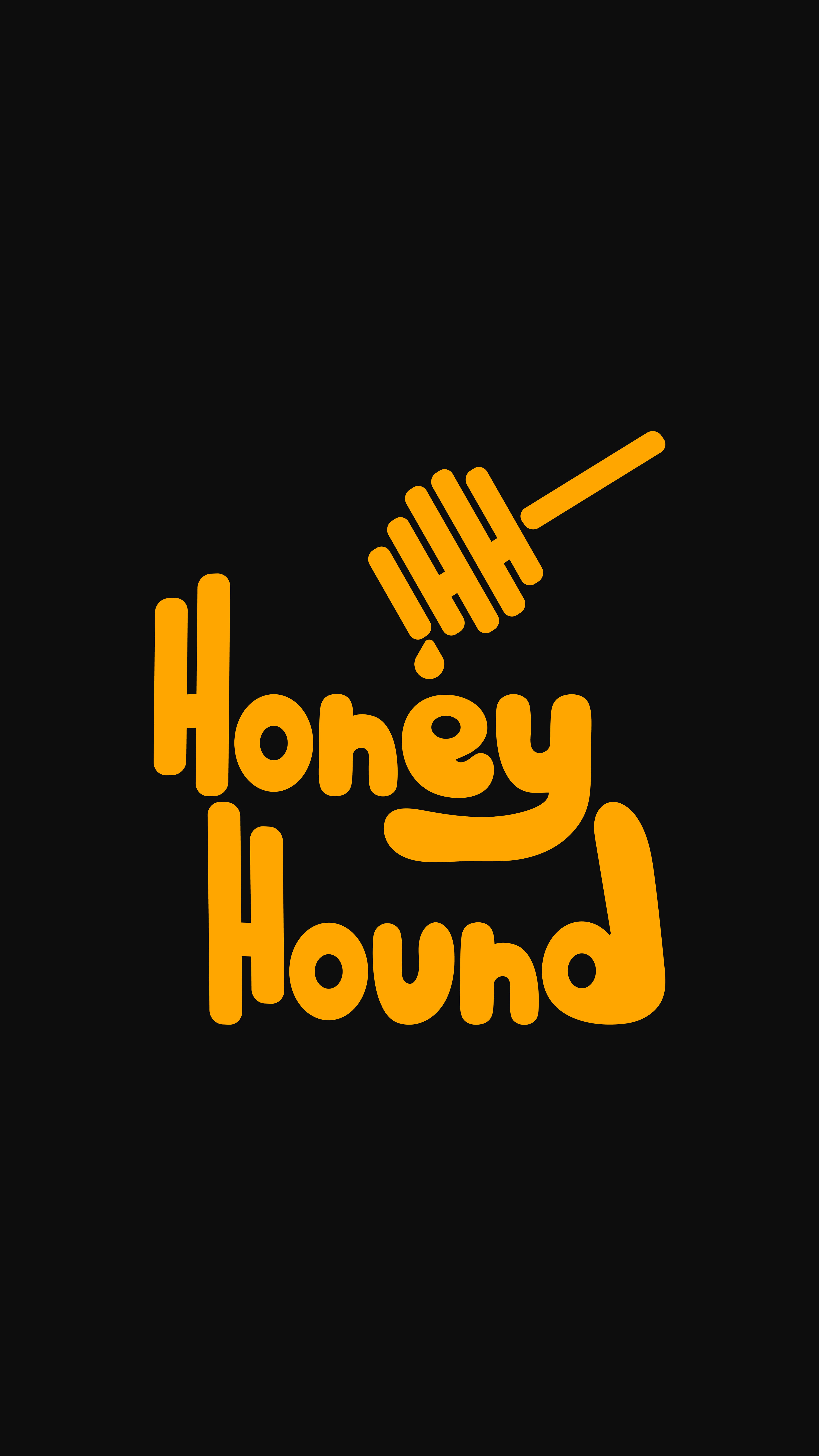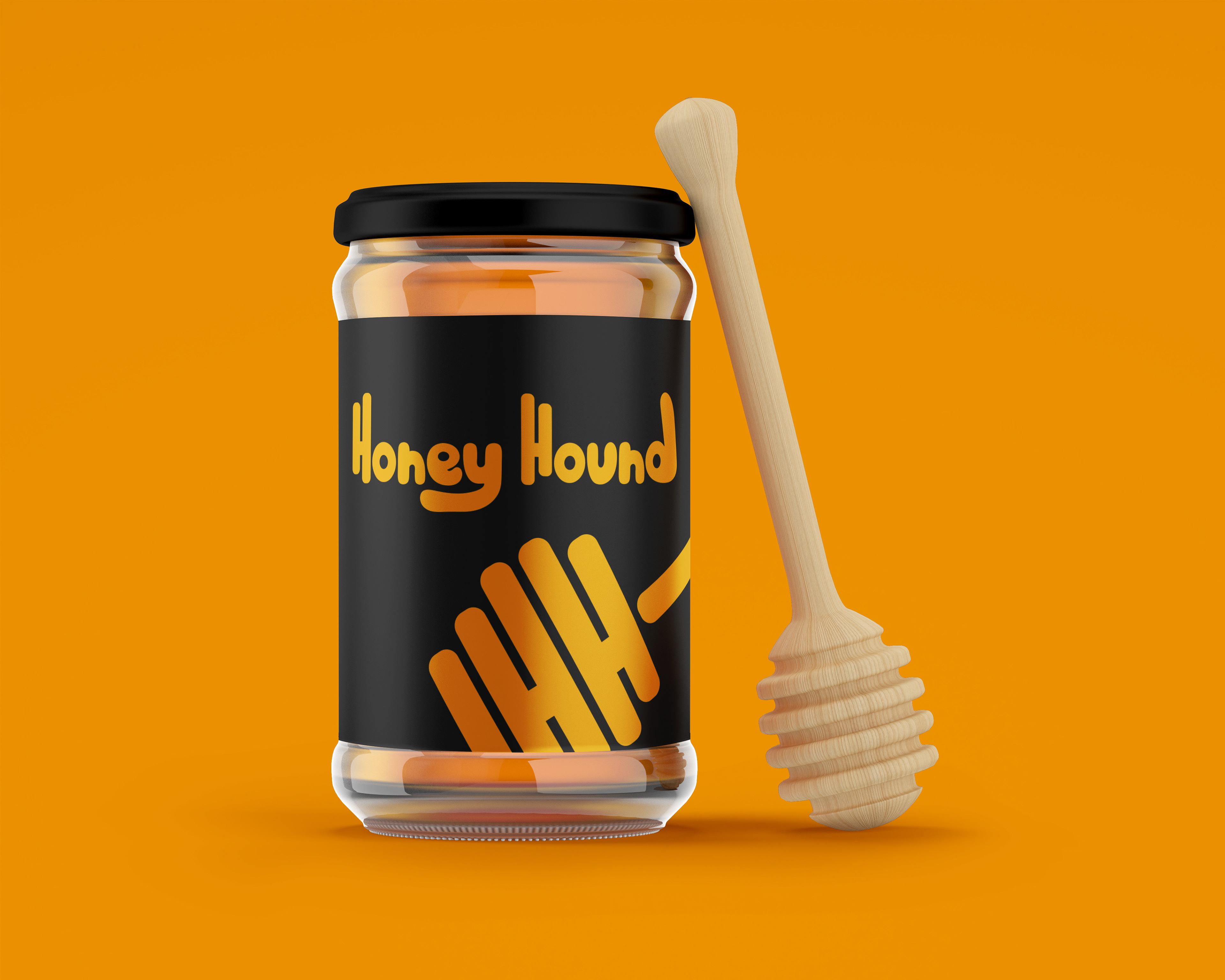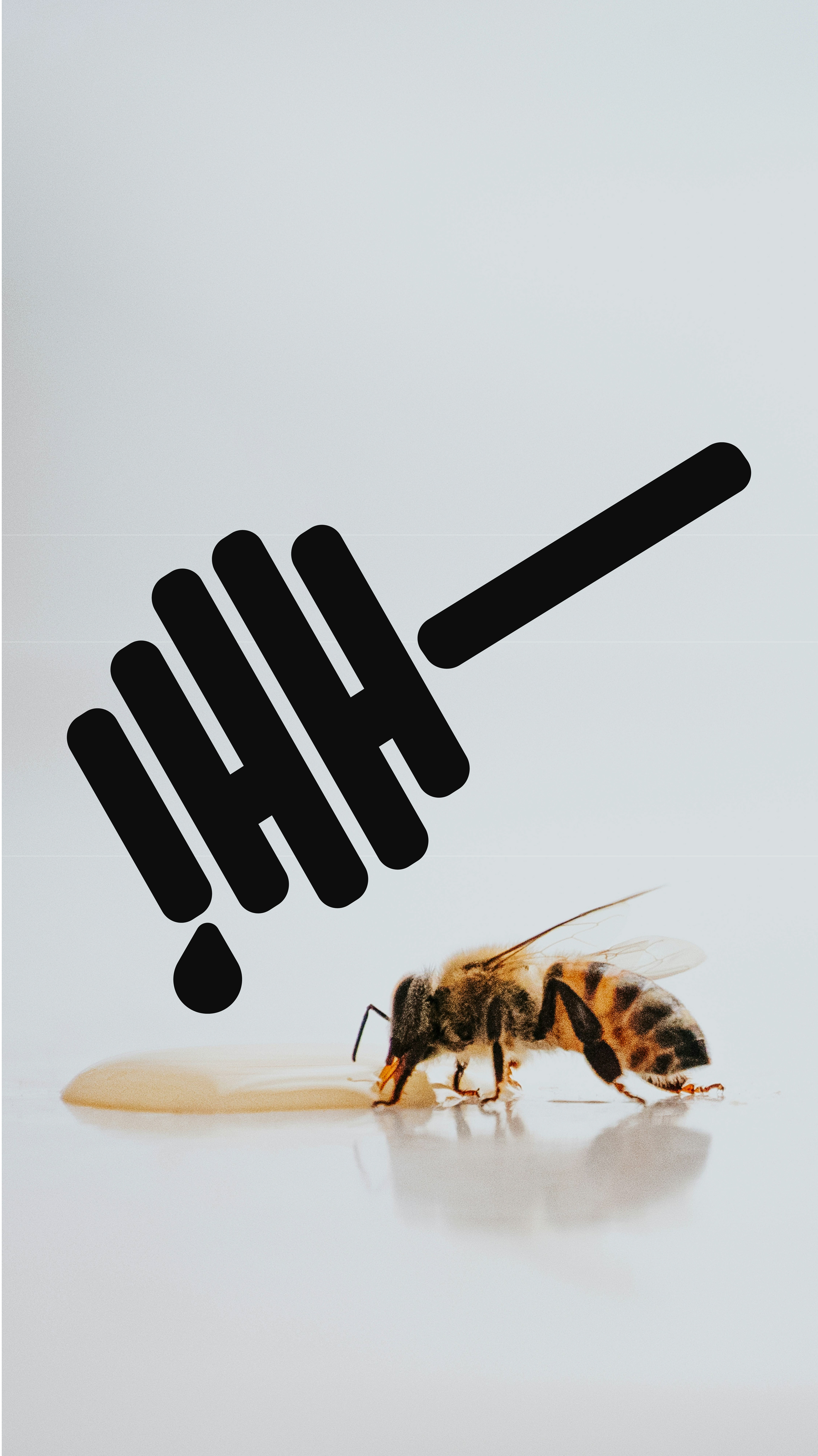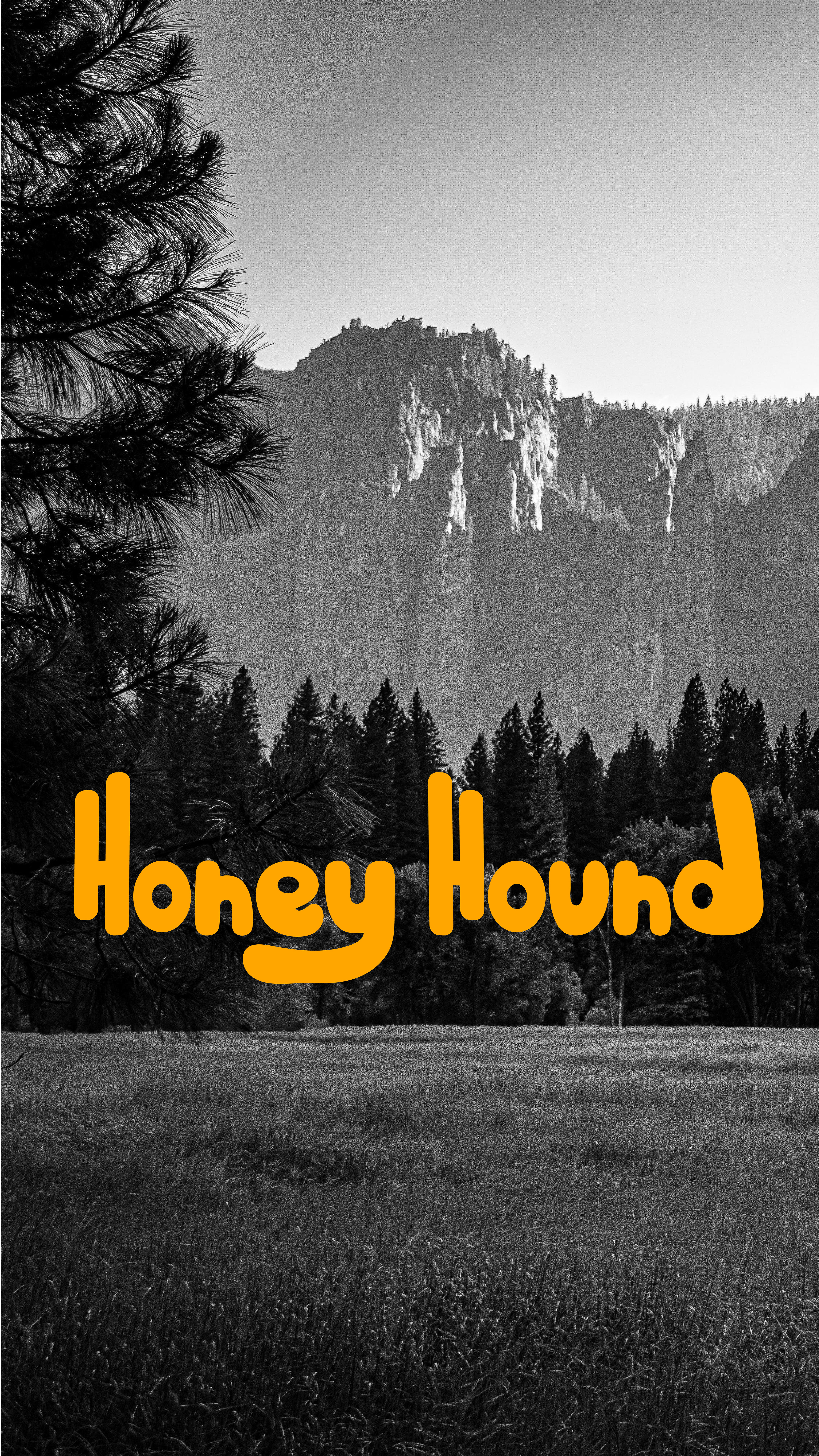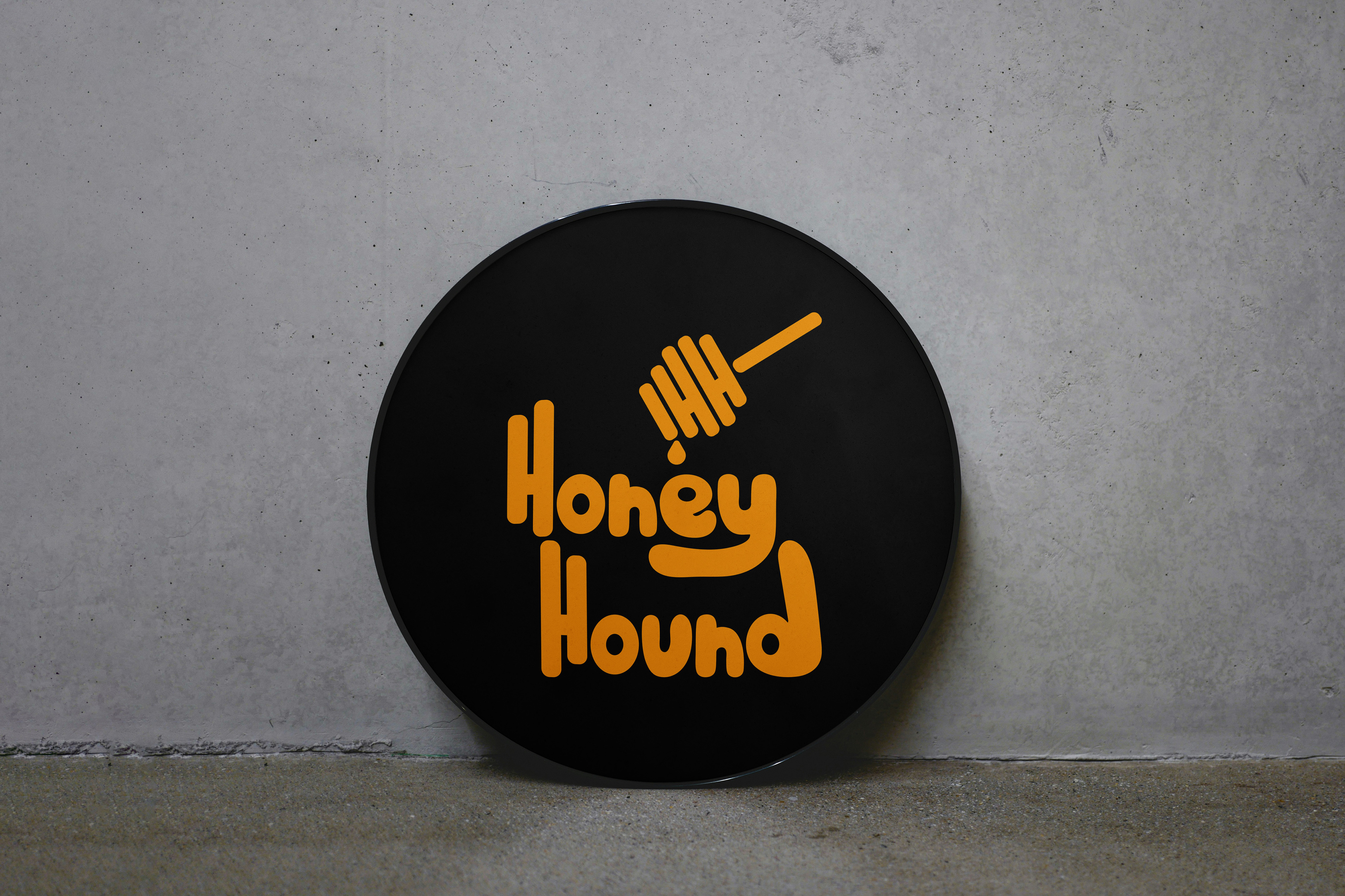
Honey Hound is a honey brand located in the Appellation Mountains. They wanted a rustic but handmade visual identity to symbolize not only where they're located but how the honey is made.
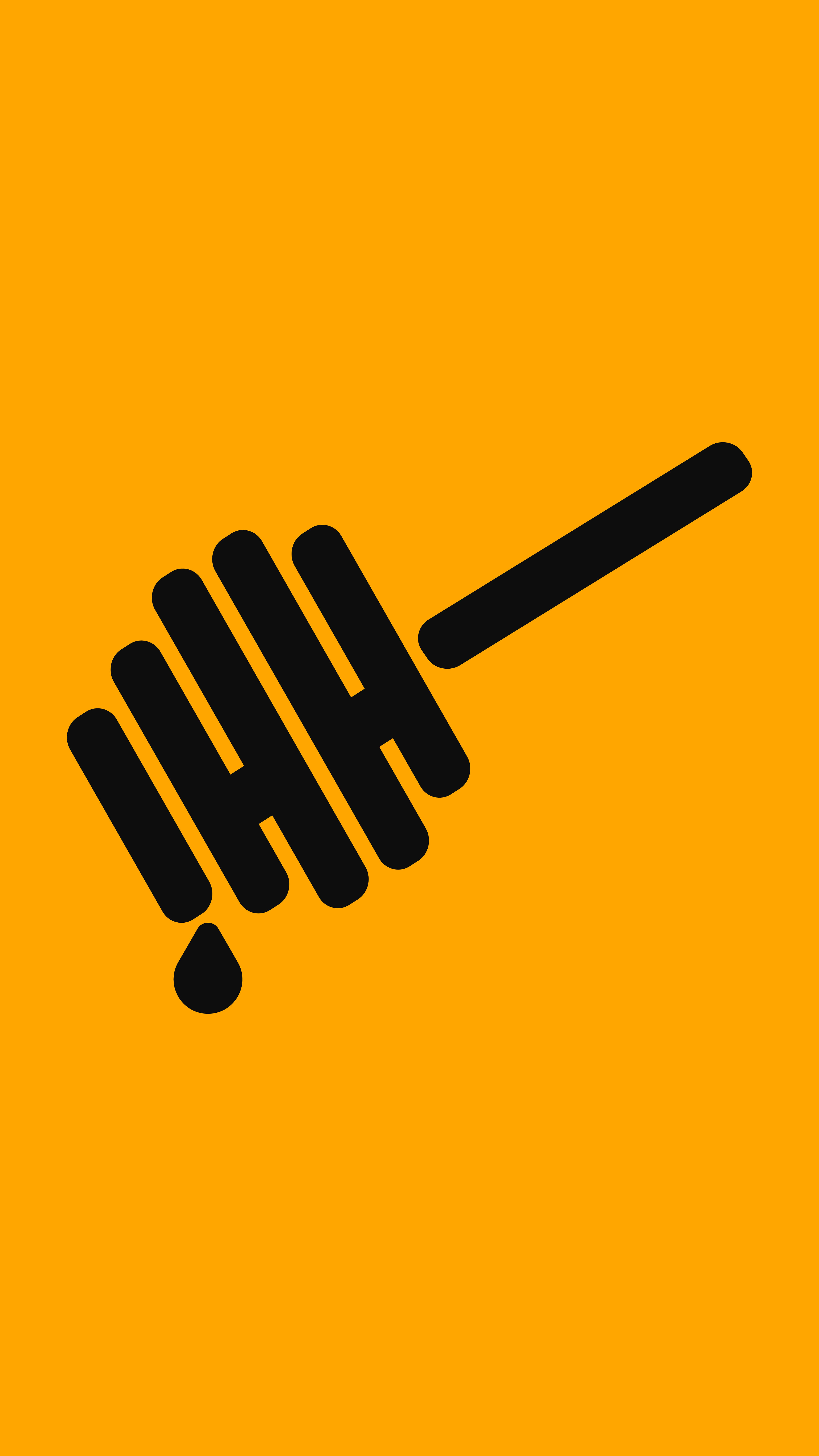
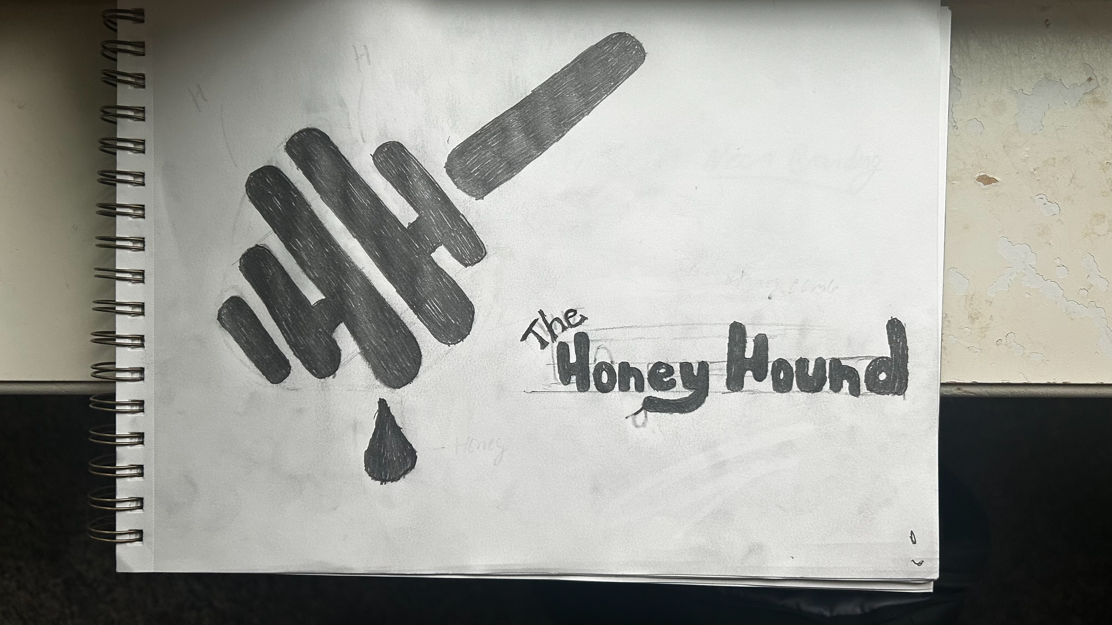
To solve this problem I sketched up a honey dropper with a drip of honey coming off of it. I also hid a double H inside the dropper to tie in the name Honey Hound. Then using the rustic yellow and black color scheme to tie back to the company and their vision and to the bees that make the honey.
The typography is also 100% hand drawn giving them that handmade feel to their logo.